MEST2:
Evaluation
The brief,
which I have been assigned to work under, requires an arthouse film to be made
for a company named “Little Picturehouse”. The film produced by my group is
called “Click”. Interestingly, the movie
contains film-noir and urban elements which is our unique selling point as it
is attractive to our target audience; this recounts back to the brief and its
specifications.
The
pre-production of “Click” has contributed massively towards the creation of the
film. Films that have similar styles as “Click” has had a major influence with
the overall making of the film as it provided a foundation to work from. “Sin City” has similar elements, which
fascinated our group especially in the way it was processed. It contains styles
that were appealing i.e. the use of detectives and the villains. Another film
that has the same aspects as “Click” is “Scarface”. The use of mafia bosses in
the film has been iconic in film history with many films being influenced by
this particular movie. Similarly, my group has used these characteristics of
the film and added these elements onto “Click”. This allowed our creative
approach to flow as it permitted different angles to be executed to present a
perfect representation of “Click”. The BBFC research had an impact as it has
informed my group about the basic guidelines needed for a 15-rated film. For
example, strong violence, frequent strong language etc. The amount of strong language was vital to be
controlled as multiple explicit words can make the audience uncomfortable.
Due to the fact that there is a
shortage of younger viewers watching arthouse movies, it has provided a purpose
for “Click” to appeal to audiences that usually are not associated with
arthouse movies. “Click” has a demographic of ABC1 as people who often go to
the cinema can relate to the experience of watching a movie in an arthouse
cinema. The audience may have to be employed or have parents that are working
as typically an arthouse film is watched by middle class or people that have
experience in the media industry. Young and Rubicam invented a successful
psychographic profile as they suggested people would fit into one of seven
groups. The target audience for Click would fit under mainstream as the action
and drama can be relatable for most audiences. Suits would be a common purchase
as there are many present inside the film.
As younger people are not usually associated with arthouse cinemas, it
would be difficult for the audience to have a wider range of an audience. As
this is an arthouse movie, there will likely be a secondary audience of 38-55
year olds. We believe there will be a 70/30 split of males to females as the
storyline and actors are predominately male and there isn’t currently a plan to
include a romance in the clip. This, perhaps, is the main weakness of the
target audience as it causes a divide in the overall reception of the film.
However, I believe that our group has succeeded in attracting a younger
audience to arthouse cinemas as it incorporated elements of cinematic action
that is usually seen in multiplex cinemas.
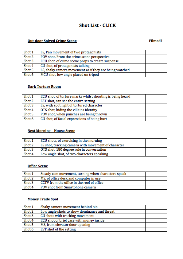
Click is shot in different
locations as it represents the different societies and age groups that the
target audience covers. One area that was shot was in Canary Wharf; this scene
was to show the sophisticated side of Click. The rest of the scenes were in
local areas as the younger audiences can gain personal identification with the
film. The overall production has a slow structured establishing shot to reveal
how one of the protagonists acquired his superpowers. Though, we chose to contrast
this immediately with a torture scene, I believe that it allows the interesting
camerawork and editing to be admired. The different shots were used to give the
audience the impression of acting and allowed for total diversion from reality.
By subverting some stereotypes it allows the applying of contrapuntal sounds in
scenes which portrays violence, it lets the audience become fully focused on
the film. This allows the main objective, which is to make sure that the
arthouse theme is met, be completed successfully. Barthes’ enigma and action codes
were also employed to allow the viewer to have a better understanding when a character
is introduced. The strengths of the torture scene is the unique style of the
editing however the lighting in this clip could have been improved as it would
reduce the amount of grain which is visibly shown. Additionally, another key
scene in the extract was the discovery of ‘Spiker’s’ body. The stimulating use
of cinematography in this scene helps increase tension. This assists the bewildered
audience with the raised tension further enhances the approval of the film; the
film follows the arthouse theme throughout. The major scene in Click is when
the fight scene starts. There is the classic convention of a shootout between
the protagonists and antagonist. By using jump cuts, it builds tension and
using shot/reverse shots allows different angles of the fight scene to be
shown. Interestingly, the final part of the scene uses point of view shots.
This allows Blumler and Katz’s Uses and Gratifications theory to be applied in
Click. There is a clear sense of personal identification and diversion to occur
for the audience. Also, by introducing the Good vs. Evil concept, our group
created some binary opposition (Levi-Strauss). This also provides a voyeuristic
pleasure for the viewer as the audience feel like they are emotionally
involved. An improvement that could have been introduced is the lighting as the
scene became distinctively darker. This allowed certain shots to contain noise
which depreciates the viewing experience.
The print work matches the key
conventions of an arthouse cinema brochure or an arts centre as it helps inform
the target audience about the films being released. This information is
important as there are sections in which helps understand what films like Click
are made and whether there are exclusive features. Not only this but it also
has aspects of the personal identity appeal, in that readers may be able to
feel that certain situations apply to them for example the process of making a
film. On my front cover, there is a solid magazine publication title with the
date. To gain the attraction of the reader, the central image is positioned in
agreement with the rule of thirds. To have a specific colour scheme is
important as it enhances the professional outlook of the print work. The Little Picturehouse branding is visibly noticeable
with social media links at the top. Print work containing large text is difficult
to read which inevitably puts off audiences. On the contents page, I worked a straightforward
design to list the films and exclusive features in the magazine however
inserted an imaginative outlook by introducing a montage of pictures from the
represented films. I also included quotations from famous directors to
influence and attract audiences to enjoy the film industry. I believe that there
is synergy with the other pieces of print with the branding as I feel that I
followed the conventions of an arthouse brochure. However there are element in
which it can be improved. For example, the double page spread could have been
edited in a more sophisticated
In Click, we attempted to embody a wide
set of societies and cultures. In order to stand out, the group decided to
subvert Hollywood stereotypes. The use of two main protagonists, who are
culturally diverse, is important as it subverts the stereotypes in films. Culturally,
families from around the world should be able to represented well enough;
actors in films are generally from America. Due to the fact that typically Hollywood’s
leads are usually white, it subverts the main ideologies in the film industry. It
provides a different angle as the audience can identify with the characters. Therefore,
we can use Perkins’ theory to show that certain stereotypes are not permanently
negative. However, we can likewise operate Medhurst’s shorthand value judgement
with the main antagonist due to the fact that he is of an ethnic minority. Additionally,
my group decided to use a set of teenagers as the main cast. This is important
as usually adults generally gain the leading role. By using teenagers, the
younger audience gain a sense of personal identification. On the whole, I deem that
the representations, we have shaped in this extract, we have undermined the
conventional standards in cinema and this corresponds well with the arthouse
genre as a whole.
Promoting films online has been a
major tool to reach out to a larger audience as the reception that websites
like YouTube are receiving is massive. This becomes evident especially major
industries are releasing trailers online. I believe the online film blog can
support the promotion of our arthouse film as audiences are the world can
access and assess whether they would find the film interesting. To use the
internet is important as it can give a psychological advantage in succeeding in
reaching your target audience. In order to reach out to the target audience,
the content available in the online blog should be attractive to our audience.
Audiences want to feel a sense of personal satisfaction and the inclusion of
bloopers can attract audiences. Social media has become a great force in
marketing as people are able to voice out their own opinions regarding the
specific film. This can provide a sense of comfort for other people as they
could consider whether watching a certain film in advised by viewers that
watched before. Evidently, there are a larger audience in social media as
people can be able to stay connected and voice their own opinions. The creative
response is important as it is able to be evaluated in different angles and
fully assessed. There are elements of
user-generated content that can be incorporated, for example parodies and the
audience creating their own trailers. Films like Ill Manors use a unique
campaign to promote their movie to a city-wide scale. The campaign has provoked
a response as people used this hashtag as a chance to voice their opinions. The
fact that it was being screened at major landmarks suggests that people that
were generally not associated with the genre and the class are being notified
about the hidden truths. This technique is a unique way to promote the movie.
This provided a clear example that can be used for our own film.
I believe that Click has succeeded
in meeting the original brief as it has incorporated many elements that attract
a larger field of audiences. The inclusion of drama, crime and action as well
as providing a sophisticated outlook has caused a successful integration of
cultures. This, in fact, is the principal reason in why Click can become
successful in the marketplace as the younger audience can fell included in the
voyeuristic pleasures.